data %>%
LandscapeR::ls_plot_static(x_var = V1,
y_var = V2,
fill_colour = "#808080")4 Conversation Landscape
The ‘Conversation Landscape’ method has proven to be an effective tool for querying, auditing, and analysing both broad concepts and finely grained topics across social conversations on all major platforms, as well as web pages and forums.
4.1 Project Background
Working with semi-structured or unstructured high-dimensional data, such as text (and in our case, social media posts), poses significant challenges in measuring or quantifying the language used to describe any specific phenomena. One common approach to quantifying language is topic modelling, where a corpus (or collection of documents) is processed and later represented in neater and simplified format. This often involves displaying top terms, verbatims, or threads highlighting any nuances or differences within the data. Traditional topic modelling or text analysis methods, such as Latent Dirichlet Allocation (LDA), operate on the probability or likelihood of terms or n-grams belonging to a set number of topics.
The Conversation Landscape workflow offers a slightly different solution and one that partitions text data without a specific need for burdening the user with sifting through rows of data in order to segment documents with hopes of understanding or recognising any differences in language, which would ideally be defined more simply as topics. The is mostly achieved through sentence transforming, where documents are converted from words to numerical values, which are often referred to as ‘embeddings’. These values are calculated based on their content’s semantic and syntactic properties. The transformed values are then processed again using dimension reduction techniques, making the data more suitable for visualisation. Typically, this involves reducing to two dimensions, though three dimensions may be used to introduce another layer of abstraction between our data points. The example provided throughout this chapter, represents some text data as nodes upon a two-dimensional space.
This documentation will delve deeper into the core concepts of sentence transforming and dimension reduction, along with the different methods used to cluster or group topics once the overall landscape is mapped out, referring back to our illustrated real-world business use case of these techniques. We will then later look at best practices and any downstream flourishes that will help us operate within this work-stream.
4.2 Final output of project
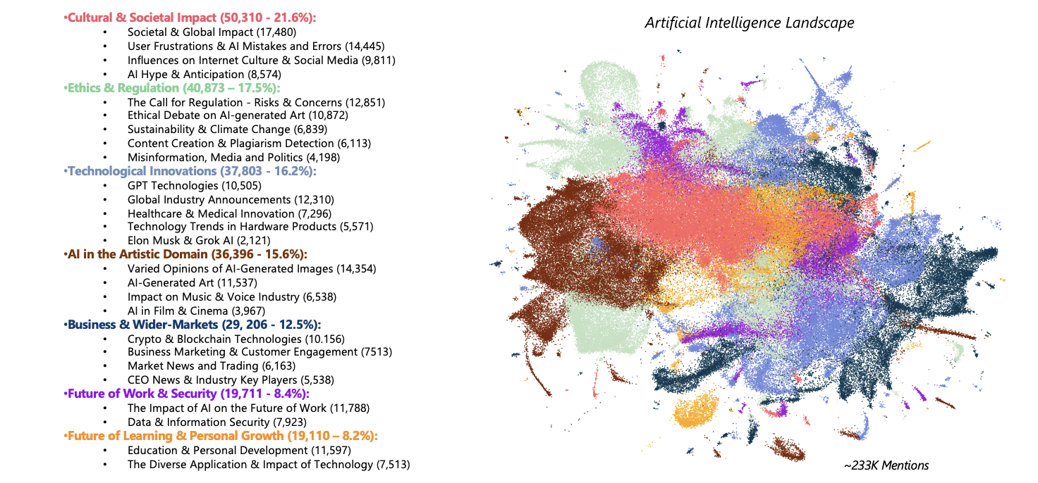
An ideal output, like the one shown below should always showcase the positioning of our reduced data points onto the semantic space, along with any topic or subtopic explanations alongside, using color coding where appropriate. While we sometimes provide raw counts of documents per topic/subtopic, we always include the percentage of topic distribution across our data, occasionally referred to as Share of Voice (SOV).
4.3 How to get there
As promised, we will provide some more context as well as the appropriate information surrounding the required steps taken, so that a reader may replicate and implement the methods mentioned throughout so far, providing an efficient analysis tool to use for any set of documents, regardless of domain specifics. While the example output provided displays a simplified means for visualising complex and multifaceted noisy data such as the ‘Artificial Intelligence’ conversation on social, there are a number of steps that one must take carefully and be mindful of throughout, in order to create the best fit model appropriate for a typical Conversation Landscape project.
The broad steps would include, and as one might find across many projects within the realms of Natural Language Processing (NLP):
Initial Exploratory Data Analysis (EDA): Checking that the data is relevant and fit to answer the brief.
Cleaning and Processing: Removal of spam, unhelpful or irrelevant data, and pre-processing of text variable for embedding.
Transforming/Embedding: Turning our words into numbers which will later be transformed again before being visualised.
Dimension Reduction: Reducing our representational values of documents to a manageable state in order to visualise.
Topic Modelling/Clustering: Scientifically modelling and defining our data into a more digestible format.
Exploratory Data Analysis (EDA):
Whether the user is responsible for data querying/collection or not, the first steps in our workflow should always involve some high-level checks before we proceed with any of the following steps in order to save time downstream and give us confidence to carry over into the data cleaning and processing steps and beyond.
First, one should always check things like the existing variables and clean or rename any where necessary. This step requires a little forward thinking as to what columns are necessary to complete each stage of the project. Once happy with our variables, we can then check for things such as missing dates, and/or if there are any abnormal distributions across columns like ‘Social Platform’ that might skew any findings or help us understand or perhaps justify the resulting topic model. Next, we can do some bespoke or project specific checks like searching for likely-to-find terms or strings within our text variable to ensure that the data is relevant and query has captured the phenomena we are aiming to model.
Data Cleaning/Processing:
Again, as we may not always be responsible for data collection, we can expect that our data may contain unhelpful or even problematic information which is often the result of data being unwillingly bought in by the query. Our job at this stage is to minimize the amount of unhelpful data existing in our corpus to ensure our findings are accurate as well as appropriate for the data which we will be modelling.
Optimal procedures for spam detection and removal are covered in more detail [here]will include link when data cleaning section is complete. However, there are steps the user absolutely must take to ensure that the text variable which will be provided to the sentence transformer model is clean and concise so that an accurate embedding process can take place upon our documents. This includes the removal of:
- Hashtags #️⃣
- User/Account Mentions 💬
- URLs or Links 🌐
- Emojis 🐙
- Non-English Characters 🉐
Often, we might also choose to remove punctuation and/or digits, however in our provided example, we have not done so. There are also things to beware of such as documents beginning with numbers that can influence the later processes, so unless we deem them necessary we should remove these where possible to ensure no inappropriate grouping of documents takes place based on these minor similarities. This is because when topic modelling, we aim to capture the pure essence of clusters which is ultimately defined by the underlying semantic meaning of documents, as apposed to any similarities across the chosen format of said documents.
Sentence Transforming/Embedding:
Once we are happy with the cleanliness and relevance of our data, including the processing steps we have taken with our chosen text variable, we can begin embedding our documents so that we have a numerical representation that can later be reduced and visualised for each. Typically, and in this case we have used already pre-trained sentence transformer models that are hosted on Hugging Face, such as all-mpnet-base-v2 which is the specific model we had decided to use in our AI Conversation Landscape example. This is because during that time, the model had boasted great performance scores for how lightweight it was, however with models such as these being open-source, community-lead contributions are made to further train and improve model performance which means that these performance metrics are always increasing, so one may wish to consult the Hugging Face leaderboard, or simply do some desk research before settling on an ideal model appropriate for their own specific use case.
While the previous steps taken might have involved using R and Rstudio and making use of SHARE’s suite of data cleaning, processing and parsing functionality, the embedding process will need to be completed using Google Colab. This is to take advantage of their premium GPUs and high RAM option, as embedding documents can require large amounts of compute, so much so that most fairly competent machines with standard tech specs will struggle. It is also worth noting that an embedding output may depend on the specific GPU being utilized as well as the version of Python that Colab is currently running, it’s good practice to make note of both of these specifics, along with other modules and library versions that one may wish to use in the same session, such as umap-learn (you may thank yourself at a later stage for doing so). To get going with sentence transformers and for downloading/importing a model such as all-mpnet-bas-v2, there are step-by-step guides purposed to enable users with the know-how to use them and deal with model outputs upon the Hugging Face website.
Dimension Reduction:
At this stage, we would expect to have our data cleaned along with the representative embeddings for each document, which is output by the sentence transforming process. This next step, explains how we take this high-dimensional embeddings object and then simplify/reduce columns down enough to a more manageable size in order to map our documents onto a semantic space. Documents can then be easily represented as a node and are positioned within this abstract space based upon their nature, meaning that those more semantically similar will be situated closer together upon our two (or sometimes three-dimensional) plot, which then forms our landscape.
There are a number of ways the user can process an embeddings output. Each method has its own merits as well as appropriate use cases, which mostly depend whether the user intends to focus on either the local or global structure of their data. For more on the alternative dimension reduction techniques, the BERTopic documentation provides some further detail while staying relevant to the subject matter of Topic Modelling and NLP.
Once we have reduced our embeddings, and for the sake of staying consistent to the context of our given example, lets say we have decided to use Uniform Manifold Approximation and Projection (UMAP), a technique which is helpful for when we wish to represent both the local and global structures of our data. The output of this step should have resulted in taking our high dimensional embedding data (often 768 columns or sometimes more) and reduced these values down to just 2 columns so that we can plot them onto our semantic space (our conversation landscape plot), using these 2 reduced values as if to serve as X and Y coordinates to appropriately map each data point, we often name these two columns V1 and V2.
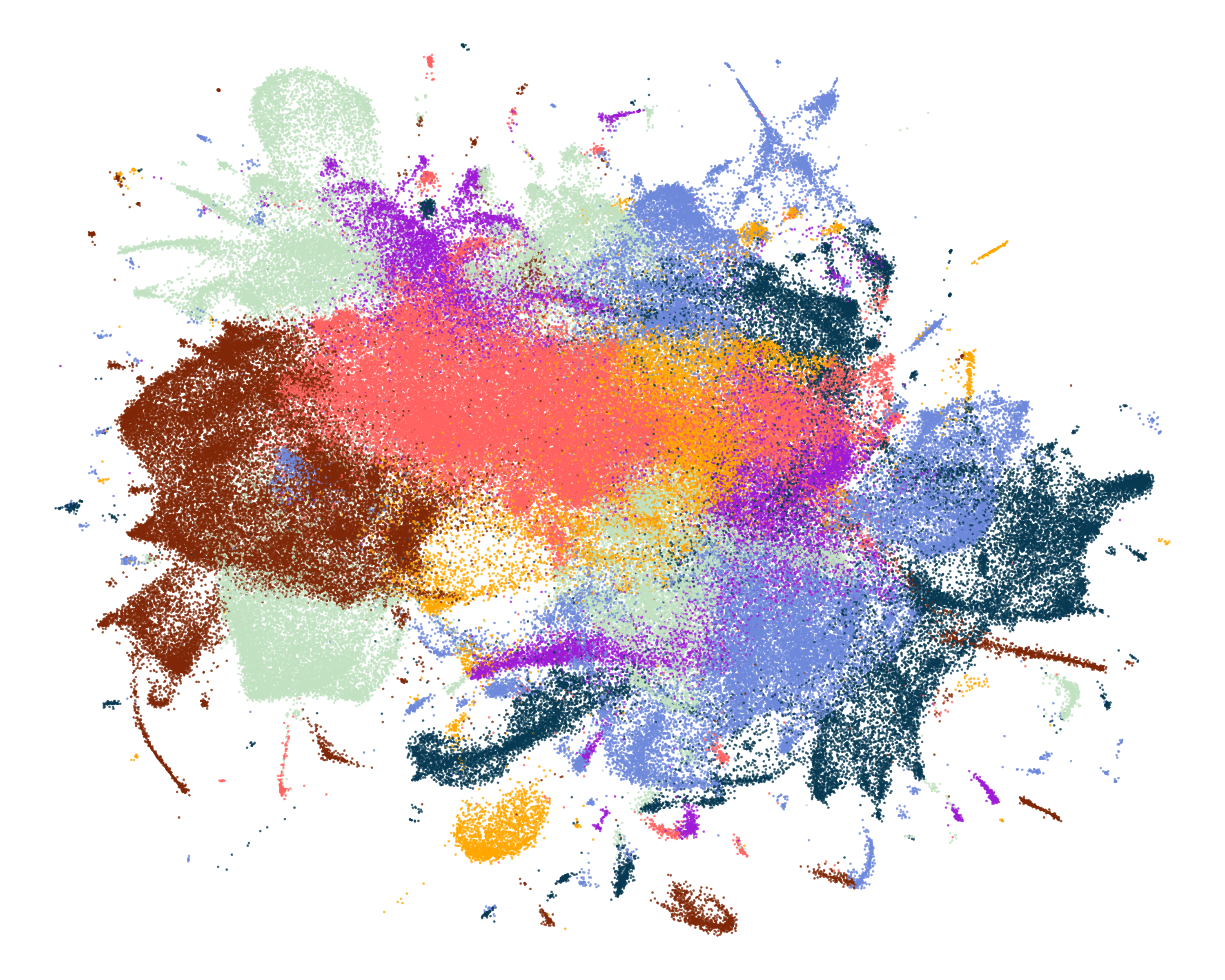
At this stage, we can use the LandscapeR package to render a static visualisation of the entire landscape, and we can select the desired colour of our nodes by making use of the fill_colour parameter. In this instance, we’ve mapped our documents onto the semantic space represented as nodes using columns V1 and V2 and coloured them a dark grey.
It’s worth pointing out, that there are a number of ways for the user to interactively explore the landscape at this stage by scanning over each node, checking the documents contents. This helps the user to familiarise with each region of the landscape before clustering. The plotly package serves as a user friendly means for this purpose, helping us gather a ‘lay of the land’ and identify the dense and not so dense sections of our data.
This shows just a 20K sample from our data, which is done only to comply with data size limits on GitHub and to be more conservative with compute and memory usage. Here, we also use a message column with breaks every 10 words to ensure the visual is neater.
data %>% plotly::plot_ly(
x = ~V1,
y = ~V2,
type = 'scatter',
mode = 'markers',
marker = list( color = '#808080', size = 1),
text = ~paste('Message: ', message_with_breaks),
hoverinfo = 'text'
)Topic Modelling/Clustering:
The final steps taken are arguably the most important, this is where we will define our documents and simplify our findings byway of scientific means, in this case using Topic Modelling.
There are a number of algorithms that serve this purpose, but the more commonly used clustering techniques are KMeans and HDBSCAN. However, the example we have shown uses KMeans, where we define the number of clusters that we would expect to find beforehand and perform clustering on either the original embeddings object output by the sentence transformer model, or we can reduce those embeddings to something much smaller like 10 dimensions and cluster documents based on those. If we were to opt for HDBSCAN however, we would allow the model to determine how many clusters were formed based on some input parameters such as min_cluster_size which are provided by the user. For more on these two techniques and when/how to use them in a topic modelling setting, we can consult the BERTopic documentation once more.
It’s also worth noting that this step requires a significant amount of human interpretation, so the user can definitely expect to partake in an iterative process of trial and error, trying out different values for the clustering parameters which determine the models output, with hopes of finding the model of best fit, which they feel accurately represents the given data.
In practise, this visualisation can be derived using our original data object with topic/cluster information appended, as well as the original V1 and V2 coordinates that we had used previously. To ensure our topics are coloured appropriately, we can create and use a named character vector and some additional ggplot2 syntax to manually assign topics with specific hex codes or colours.
# assign colours to topics
topic_colours <- c("Ethics & Regulation" = "#C1E1C1",
"Technological Innovations" = "#6e88db",
"AI in an Artistic Domain" = "#7e2606",
"Cultural & Social Impact" = "#ff6361",
"Business & Wider-Markets" = "#063852",
"Future of Learning & Personal Growth" = "#ffa600",
"Future of Work & Security" = "#9e1ad6"
)data %>%
LandscapeR::ls_plot_group_static(x_var = V1,
y_var = V2,
group_var = topic_name) +
ggplot2::scale_colour_manual(values = topic_colours) # colour nodes manually4.4 Downstream Flourishes
With the basics of each step covered, we will now touch on a few potentially beneficial concepts worth grasping that may help us overcome anything else that may occur when working within the Conversation Landscape project domain.
Model Saving & Reusability:
Occasionally, a client may want us to track topics over time or perform a landscape change analysis. In these cases, we need to save both our Dimension Reduction and Clustering models so that new data can be processed using these models, tp produce consistent and comparable results.
This requires careful planning. When we initially reduce embeddings and perform clustering, we use the .fit() method from sklearn when either reducing the dimensions of or clustering on the original embeddings. This ensures that the models are trained on the data they are intended to represent, making future outputs comparable.
We had earlier, mentioned, that it is crucial to document the versions of the modules and Python interpreter used. When we reduce or cluster new data using our pre-fitted models, it is essential to do so with the exact same versions of important libraries and Python. The reason is that the internal representations and binary structures of the models can differ between versions. If we attempt to load and apply previously saved models with different versions, we risk encountering incompatibility errors. By maintaining version control and documenting the environment in which the models were created, we can ensure the reusability of our models. Overall, this practice allows for us to be accurate when tracking and comparing topics and noting any landscape changes.
Efficient Parameter Tuning:
When we’re performing certain steps within this workflow, more specifically the Dimension Reduction with likes of UMAP, or if we were to decide we’d want to cluster using HDBSCAN for example, being mindful of and efficient with tuning the different parameters at each step will definitely improve the outcome of our overall model. Therefore, understanding these key parameters and how they can interact will significantly enhance the performance of the techniques being used here.
Dimension Reduction with UMAP:
n_neighbors: This parameter controls the local neighborhood size used in UMAP. A smaller value focuses more on capturing the local structure, while a larger value considers more global aspects. Efficiently tuning this parameter involves considering the nature of your data and the scale at which you want to observe patterns.
min_dist: The min distance argument determines quite literally how tight our nodes are allowed to be positioned together within our semantic space, a lower value for this will mean nodes will be tightly packed together, whereas a higher number will ensure larger spacing of data points.
n_components: Here is where we decide how many dimensions we wish to reduce our high-dimensional embeddings object down to, for visualisation we will likely set this parameter to a value of 2.
KMeans CLustering
n_clusters: KMeans is a relatively simple algorithm compared to other methods and components, requiring very little input. Here we just provide a value for the number of clusters we wish to form, this will either be clusters in the embeddings or a smaller, more manageable reduced embeddings object as mentiioned previously.
HDBSCAN Clustering:
min_samples: This parameter defines the minimum number of points required to form a dense region. It helps determine the density threshold for clusters and can determine how conservative we want the clustering model to be. Put simply, a higher value can lead to fewer, larger clusters, while a lower value can result in more, smaller clusters.
min_cluster_size: This parameter sets the minimum size of clusters. Like min_samples it can directly influence the granularity of the clustering results. In this case, smaller values allow the formation of smaller clusters, while larger values prevent the algorithm from identifying any small clusters(or those below the size of the provided value). It’s worth noting that the relationship between min_samples and min_cluster_size is crucial. min_samples should generally be less than or equal to min_cluster_size. Adjusting these parameters in tandem helps us to control the sensitivity of HDBSCAN, and for us to define what qualifies as a cluster.
Tip: Try starting with the default value for all of these parameters, and incrementally adjust based on the desired granularity or effect of any that we wish to amend.
Supporting Data Visualisation:
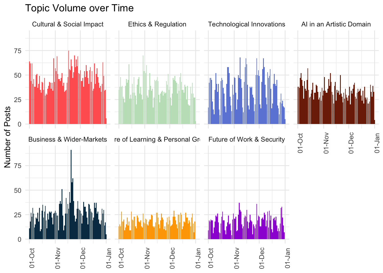
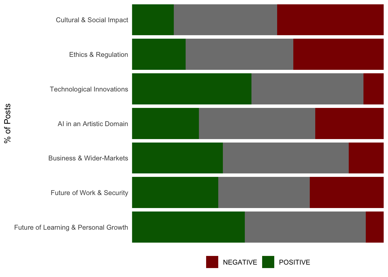
Once we have our landscape output, as shown in Final output of project, we will inevitably need to display some further information regarding our topics, most commonly; Volume over Time (VOT) and Sentiment Distribution for each.
When doing so, we would ideally keep some formatting consistencies when plotting, as we mentioned previously, the colouring of our topics must remain the same throughout so that they match up with any previous representations in existing visuals such as the landscape output. We would also want to ensure that any plot we create orders our topics by volume or at least in the same order throughout our project. We can order our topics in terms of volume easily with just a few lines of code.
First, we’ll make sure to set the factor levels of our topics by using dplyr::count() on the topic_name column, and setting the levels feature of the factor() base function based on the counted output.
# sort topics by order of volume
topic_order <- data %>% dplyr::count(topic_name, sort = TRUE)
# set levels determined by volume of topic, this orders the group variable for plotting
data <- data %>%
dplyr::mutate(topic_name = factor(topic_name, levels = topic_order$topic_name))Topic Volume over Time
Starting with volume over time, we often choose to render a faceted plot that includes all topics and their VOT for comparison. We can do so by using functionality found in packages such as JPackage for this.
Topic Sentiment Distribution
Next, we might want/need to break each of our topics out by their sentiment distribution to help shine light on any of particular interest or to help us tell a more refined story using our topic model. This can be done by using the dr_plot_sent_group() function of the DisplayR package.
data %>%
DisplayR::dr_plot_sent_group(group_var = topic_name,
sentiment_var = sentiment,
"percent", bar_labels = "none",
sentiment_colours = c("POSITIVE" = "darkgreen",
"NEGATIVE" = "darkred"))Warning in .setup_fonts(): Font 'Segoe UI' not found in system, download and
install individually to access full package functionalityWarning in .setup_fonts(): Font 'NeueHaasGroteskText Pro Md' not found in
system, download and install individually to access full package functionalityWarning in .setup_fonts(): Font 'GT Walsheim Pro' not found in system, download
and install individually to access full package functionalityAlternative Visualisations
While the two visuals we have displayed so far are relatively basic and commonly used, this does not mean that we won’t require alternative methods to display topic-level information. Often, we may render n-grams per topic to display the relationships that exist between terms/phrases, and we may create plots to showcase things such as data source or social network/platform distributions across topics.
Finally, it’s worth noting that the need for specific data visualisation methods entirely depends on the project domain and brief, as well as any outcomes/findings derived throughout. This means we ought to be flexible in our approach to utilising any technique that may assist with strengthening our understanding of the data and/or supporting our analyses.
